Prof Benjamin Hennig
Professor of Geography at the University of Iceland and Honorary Research Associate in the School of Geography and the Environment at the University of Oxford. He is also involved in the Worldmapper project.
Email: ben@hi.is
Twitter: @geoviews

Section 2: Voters, Polls and Results
- Boris’s missing women
- An expected surprise? An evaluation of polls and seat forecasts during the campaign
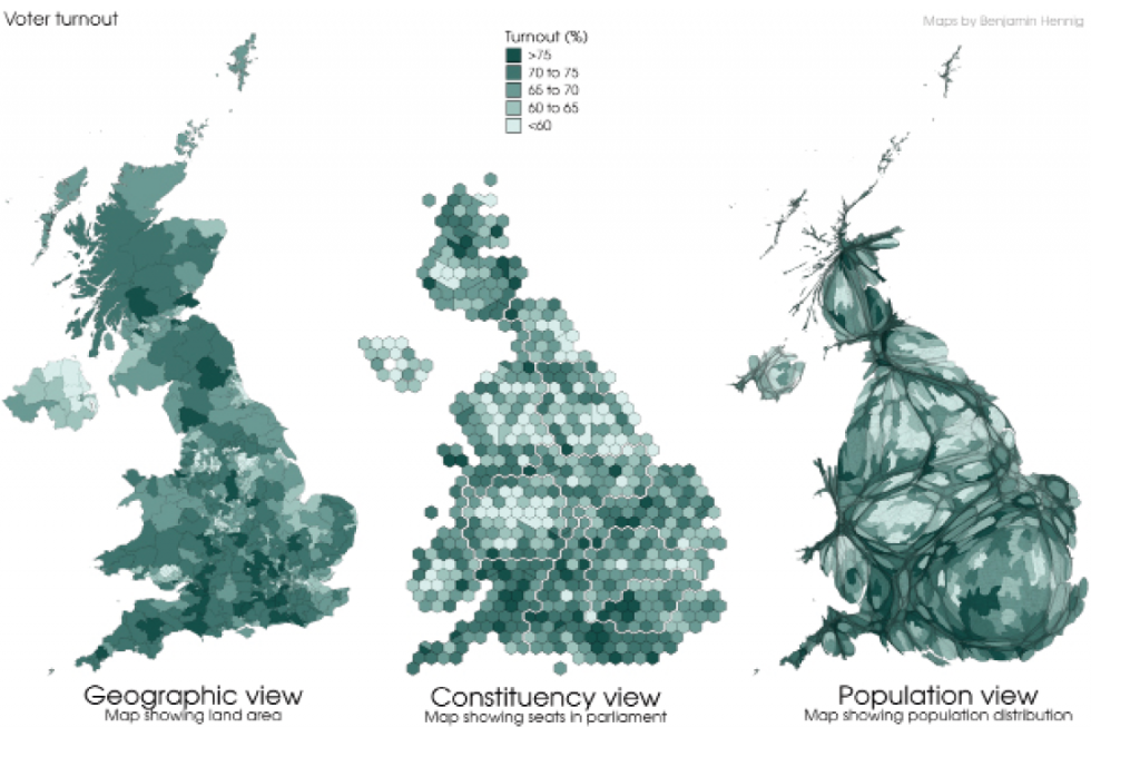
- Unprecedented interest or more of the same? Turnout in the 2019 election
- Tactical voting advice sites
- Another election, another disappointment: Young people vote left and are left behind at GE2019
- Divided we fall: was Nigel Farage the kingmaker of the Johnson victory?
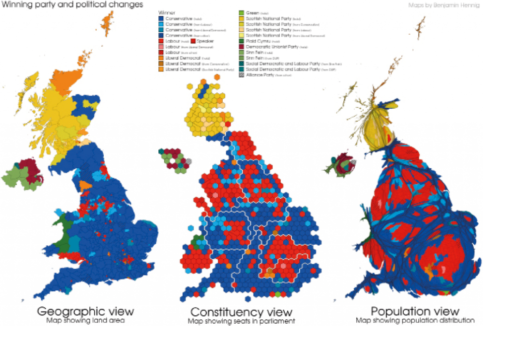
If the 2016 vote for Brexit is described as a political earthquake in the United Kingdom, then the 2019 General Election is the equivalent to the tsunami that followed it and swept over some of the deepest Labour heartlands in England. Political commentators spoke of a demolishment of the Labour Party’s ‘red wall’ as the results came in (although the ‘wall’ that may have once stood had already started to crumble in previous elections). Approaching the outcome of the General Election from a visual perspective puts such metaphors into a visual representation.
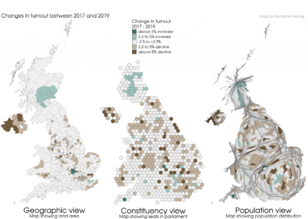
This cartographic analysis provides an assessment of the impact of some key data of this election. The mapping techniques used in this analysis are deployed to create more comprehensive insights than conventional approaches usually provide. Apart from visualising the election statistics on a ‘normal’ geographic view that shows the country’s land area, two different variations of so-called cartograms are used. The second map type is a hexagonal cartogram where each hexagon shape represents one parliamentary constituency, therefore reflecting the seat distribution in the new parliament (for technical reasons, some minor changes in constituencies in recent years are reflected in split and merged hexagons). The third map type is a gridded population cartogram where each small area is shown proportional to its total population that lives there. While the electorate is a smaller fraction of the total population, this map gives a view of how the entire population in each area is represented through the respective political party that was elected there.
Although the two cartograms have a similar conceptual approach, their overall appearance and therefore their underlying message differs, not least because constituencies vary in size (by area and population) and therefore also in the number of people that they represent.
For the unfamiliar eye, cartograms are more difficult to read and interpret than the normal map. However, the normal map highly overrepresents the large rural areas and makes it difficult to understand the patterns in the most populated areas that have equal importance when it comes to understanding the political implications of an election outcome.
In this feature, all three map types are shown alongside each other for each variable mapped here. Shown is a selected range of key aspects that arise from the vote. This allows for a comparison of these through the different cartographic perspectives.
The maps showing the winning party in each constituency also include the changes that have occurred compared to the 2017 General Election. To account for the substantial changes in the last parliament with regards to members of parliament (MPs) changing their party affiliation (voluntarily or forced), the changes considered here reflect the most recent affiliation of an MP immediately before the election.
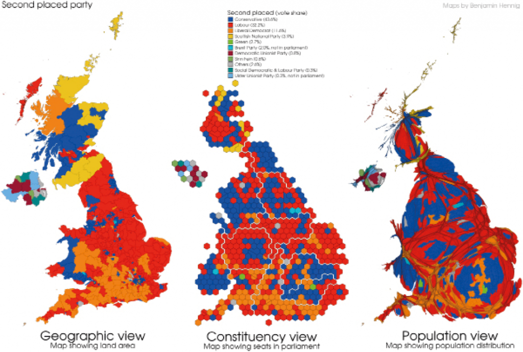
Although the political system in the UK is based on a first-past-the-post representation, a look at the second placed candidates that stood for election is relevant. Some of the constituencies were won with a very small majority. 30 constituencies had a majority of under 1000 votes, another 32 were won with less than 2000 votes difference, which demonstrates what differences such small margins can make for the overall outcome in a first past the post system.
When viewing the maps of winners and second placed parties alongside each other, it becomes clear from the patchwork of colours shown here that despite a Conservative landslide win the country remains very much split politically.
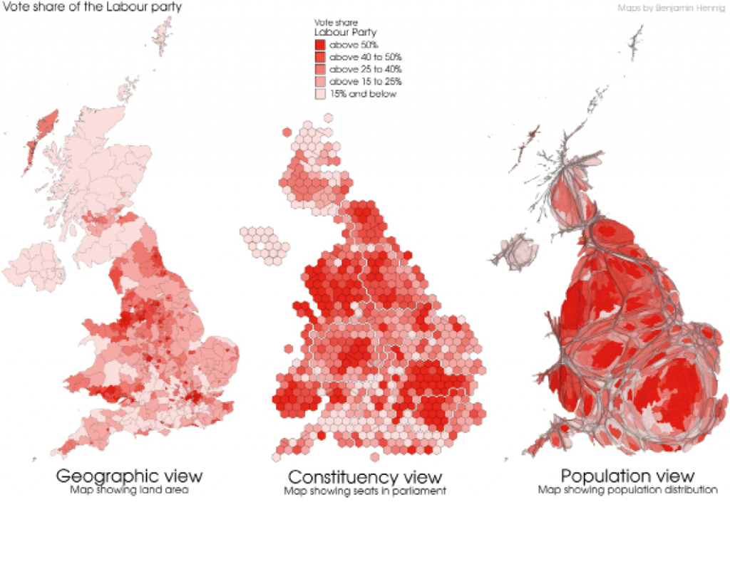
The Conservative vote has spread widely at this election, as can be seen in more detail in the vote share maps included here for the Conservatives and Labour. Nevertheless, former Labour strongholds are still not completely in Conservative hands and the cartograms relativise the ‘disappearance’ of the Labour vote slightly in its magnitude.
Lastly, what was portrayed as election fatigue amongst voters has affected parties to different degrees. In this third general election within 4½ years, overall turnout went down by 1.5 per cent to 63.7 per cent of registered voters. The spatial patterns of this are patchy and changes in turnout were perhaps not decisive, although it can be seen that in many seats won by the Liberal Democrats and the Scottish National Party turnout went up, while in many Conservative and Labour-won areas it was more likely to be down compared to the 2017 election.
These maps tell manifold stories of the 2019 election that are most likely to determine and shape the politics of the forthcoming years. How this matters geographically as indicated in this brief analysis is an important aspect in understanding the political implications of the election and – to stay with analogies from nature – the political storms that many commentators expect to follow.