Dr Benjamin D. Hennig
Associate Professor of Geography at the University of Iceland and Honorary Research Associate in the School of Geography and the Environment at the University of Oxford. He is involved in the Worldmapper project and is author of the mapping blog www.viewsoftheworld.net.
Email: ben@hi.is
Twitter: @geoviews

Section 2: Voters, Polls and Results
- A glorious defeat: anti-politics and the funnelling of frustration
- Younger voters politically energised, but the generational divide deepens
- Why the younger generation of Corbynistas?
- Young people and propaganda in the wake of the 2017 election
- The generation election: youth electoral mobilisation at the 2017 General Election
- The 2017 General Election: How Votes were split between “open and closed”
- UKIP’s former supporters were crucial to the outcome – but not as generally expected
- Why did the Lib Dems fail to benefit from the anti-Brexit vote?
- Meeting the public: the perils and pitfalls of ‘walkabout’ questions to Theresa May in GE2017
- Political participation in the UK: why might voters have voted?
- Moments of accidental connection with the ‘Great British Public’: because Brenda et al know best!
- When democracy kicked back
Data and statistics play a central role in election analyses. While politicians, spin doctors and commentators quickly aim to interpret the outcome according to their views, it is a much more complex task to provide a more thorough analysis of the underlying geographical patterns, demographics and other factors that have contributed to a specific election outcome.
Geography matters not only in its physical dimension, but just as much in its social and political spaces
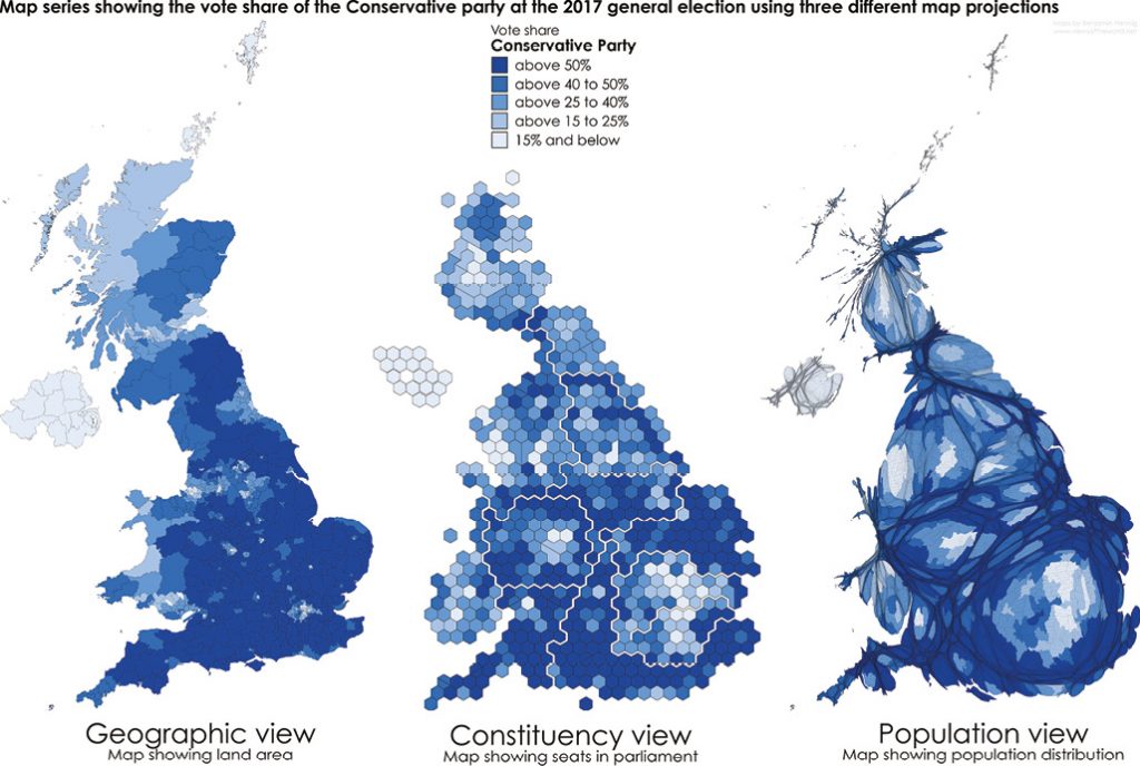
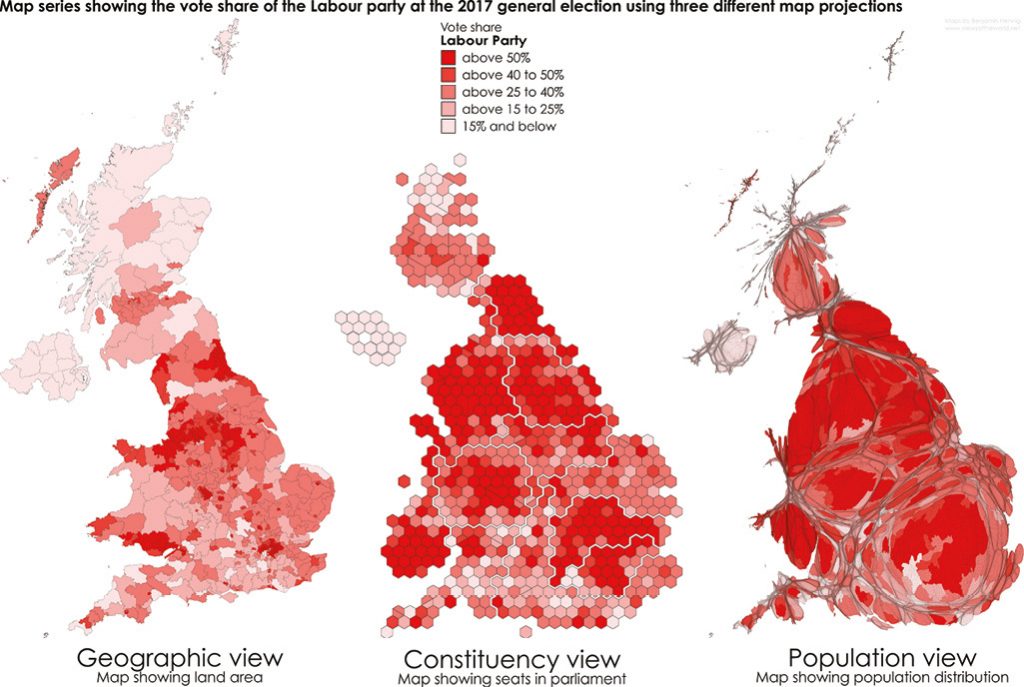
From a geographical perspective maps are important in evaluating the spatial voting patterns in an election. Maps give an immediate understanding of the emerging political landscapes in a quickly accessible and more intuitive way than numbers or ordinary charts. They also allow for a visual exploration as well as revealing spatial correlations, which is particularly valuable when the actual outcome is as unexpected and surprising as in 2017.
The contribution of cartographic research has led to an increasing diversity of electoral maps in recent years. Along with the digital turn in cartography that has shifted map production to computers over the past 40 years more advanced methods of geographic data analysis and its visualisation were developed that contribute to different types of electoral maps that have become more common in recent years, especially in the United Kingdom.
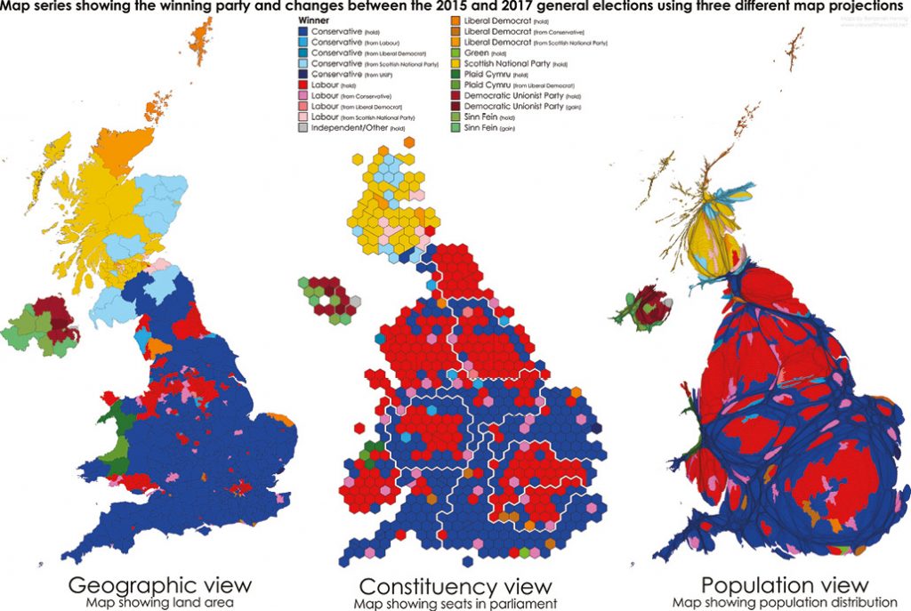
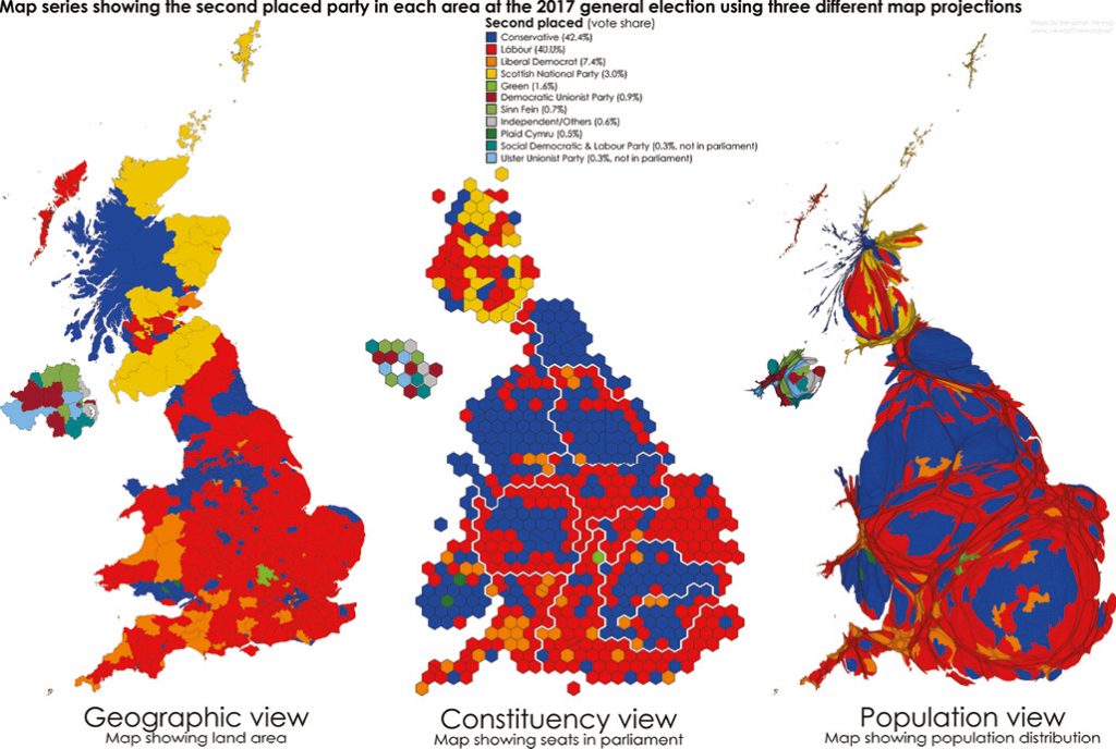
This cartographic analysis of this June’s election results provides different insights into the underlying spatial patterns by using three types of maps. Apart from a geographic perspective using a conventional land area map, two so-called cartograms allow for the results to be seen from very unique angles. Cartograms are maps that are transformed on a ‘scale other than a true scale’. This means that statistics other than land area determine the shape of a map, while still retaining basic geographical references.
The unusual shape and still widespread use of cartograms can make them hard to read and understand for the untrained eye. When accustomed to the map display, they can reveal unique and novel insights into the underlying data that conventional maps fail in conveying. Two types of cartograms are used in this feature to provide such additional insights: The hexagon shaped cartogram is a representation of the parliamentary constituencies, each constituency being represented by a hexagon (some changes in constituencies over the past decades are reflected in split and merged hexagons). The other cartogram is a so-called gridded cartogram which works like an equal-population projection in which each person gets an equal amount of space by resizing grid cells of equal area according to their total population. Less populated areas become smaller, while densely populated areas are increased in size.
The gridded population cartogram magnifies the most populated parts of the country, so election results in cities hardly visible in a normal map become visible in the cartogram. This is also the most accurate depiction of how people voted relation to each political party. Though true to how people are represented, this equal-population projection does not fully reflect the share of seats each party holds in parliament due to the first-past-the-post principle. The size of the electorate in each constituency varies quite significantly, reaching from slightly below 22,000 (Na h-Eileanan an Iar in Scotland) to almost 109,000 (Isle of Wight in South East England). The actual political implications are therefore best shown using the hexagon map which displays geographically the share of seats each party holds.
Here are some of the patterns that become visible:
The overall results of the winning party reflect a typical geographic pattern of voting where rural constituencies are more likely to vote Conservative while urban areas largely vote Labour. The population cartogram highlights this particularly well, as it reduces the dominance of rural areas due to lower population densities. This fairly consistent pattern is again manifested at this election with London now dominated by Labour constituencies. The Urban/Rural divide becomes much clearer in the population cartogram.
An urban-rural, but also a North-South divide in England become even more apparent in the cartograms. These divisions are hard to identify in a conventional map, since they correlate closely with the population and constituency distribution. Labour’s strongest vote shares are in the urban centres, even in some constituencies where Labour did not win an outright majority. The Conservative strongholds, in contrast, are largely in the East, South East and South West of England as well as in the suburban fringes in the North. Similar patterns are repeated in Scotland and – to a smaller extent – in Wales.
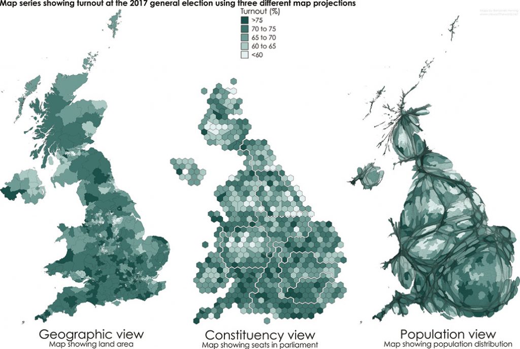
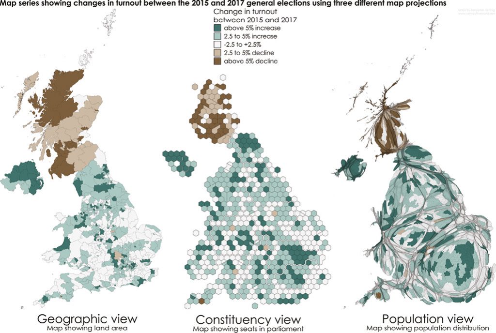
A final look at the voter turnout reveals turnout was comparably high at 68.7 per cent and with a turnout below 60 per cent found in the old industrial North of England and parts of Scotland, largely areas of stronger Labour support. More striking, however, is the change in turnout in Scotland compared to the 2015 general election. While turnout was relatively high in most parts of Scotland, it has reduced almost everywhere, in some parts by more than 5 percent. Having been called to the polling booth for the fourth time in three years might have led the Scottish electorate to experience voter fatigue.
To fully understand the new political landscapes of the United Kingdom, only a combination of different perspectives as shown here can help to gain a more complete picture. Geography matters not only in its physical dimension, but just as much in its social and political spaces that are depicted in these maps.